


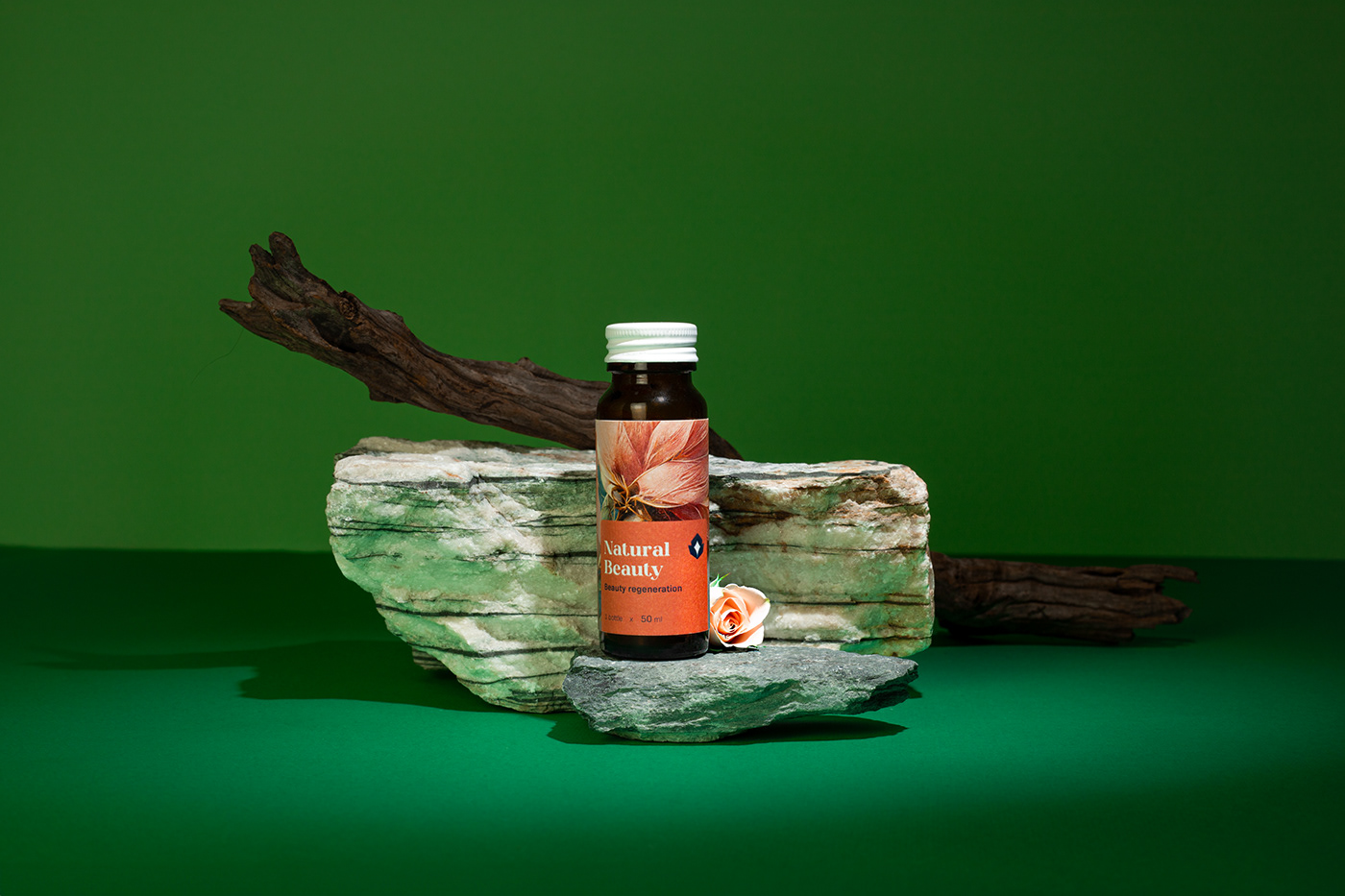
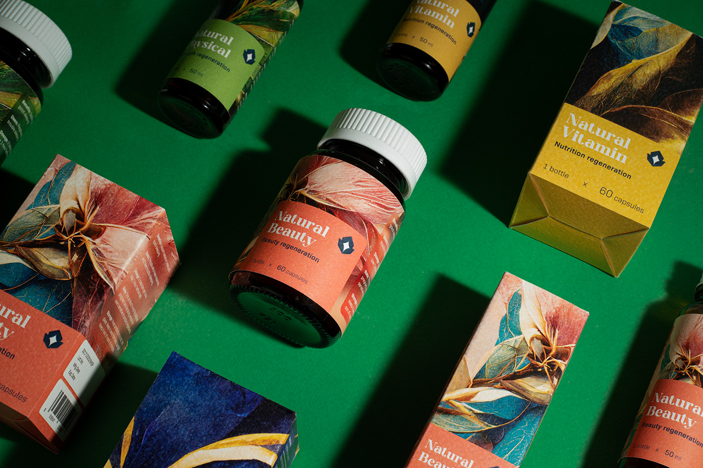
Approaching the project with the goal of conveying the Brand Essence “From Nature”, we have combined the natural visual and digital design method on the Ori Solutions functional supplement packaging. We created a new design language called "Natural Digital Art".
Logo:
The logo design is a combination of two symbols, which are half-closed hands and a star shape shining from within. The bright star stands for customers’ health and life quality, which Ori Solutions team will devote all their energy and enthusiasm to protect.
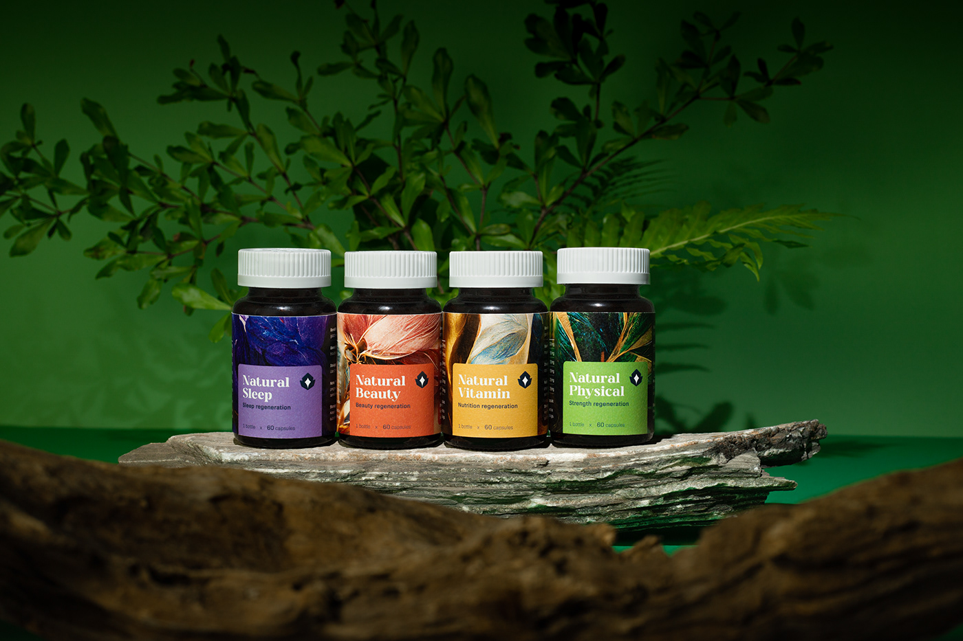
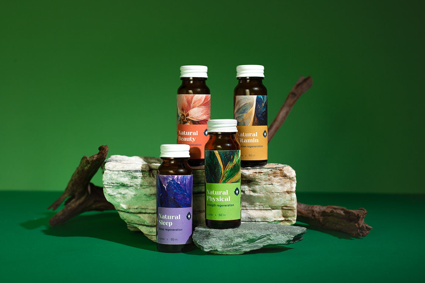
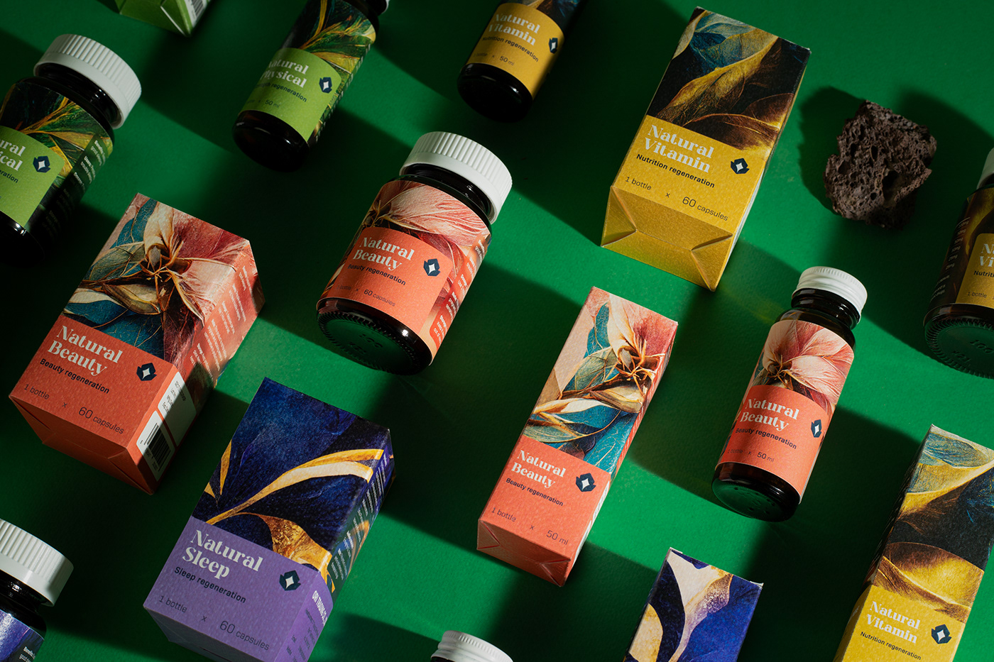
Color System:
The brand uses a tropical theme color system, expressing the essence of nature and creating a difference between product lines. The packaging designs have a simple layout structure to achieve the goal of maximum usability.
Design Method:
By combining digital art with nature, we created eye-catching abstract paintings that showed a close connection with nature. The result is a brand-new design method that ensures visual appeal and fully conveys the brand identity.


Let’s build something together
Client: Ori Solutions
Agency: Vũ Digital
Timeline: 2022
Credit
Graphic Designer: Wilson Huy, Tâm Vũ
High-End Retouch: Big Brother
Brand Writer: Dnm Phat, Huy Vũ
Save the Moment: Quyền Vũ
Account Manager: Tracy Nguyễn
Project Leader: Quyền Vũ


